The Bouchon
Bringing new energy to the east end.

Re-energising The Silk District’s identity for The Bouchon, its final phase.
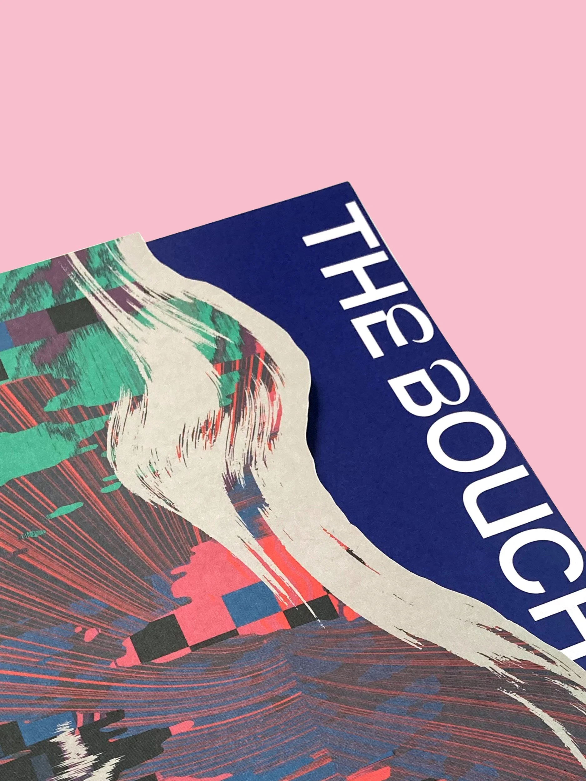
With a name and identity inspired by the areas historic links to the Silk industry, we refreshed and reenergised The Silk District’s identity and collateral, building on its already distinctive brandworld.
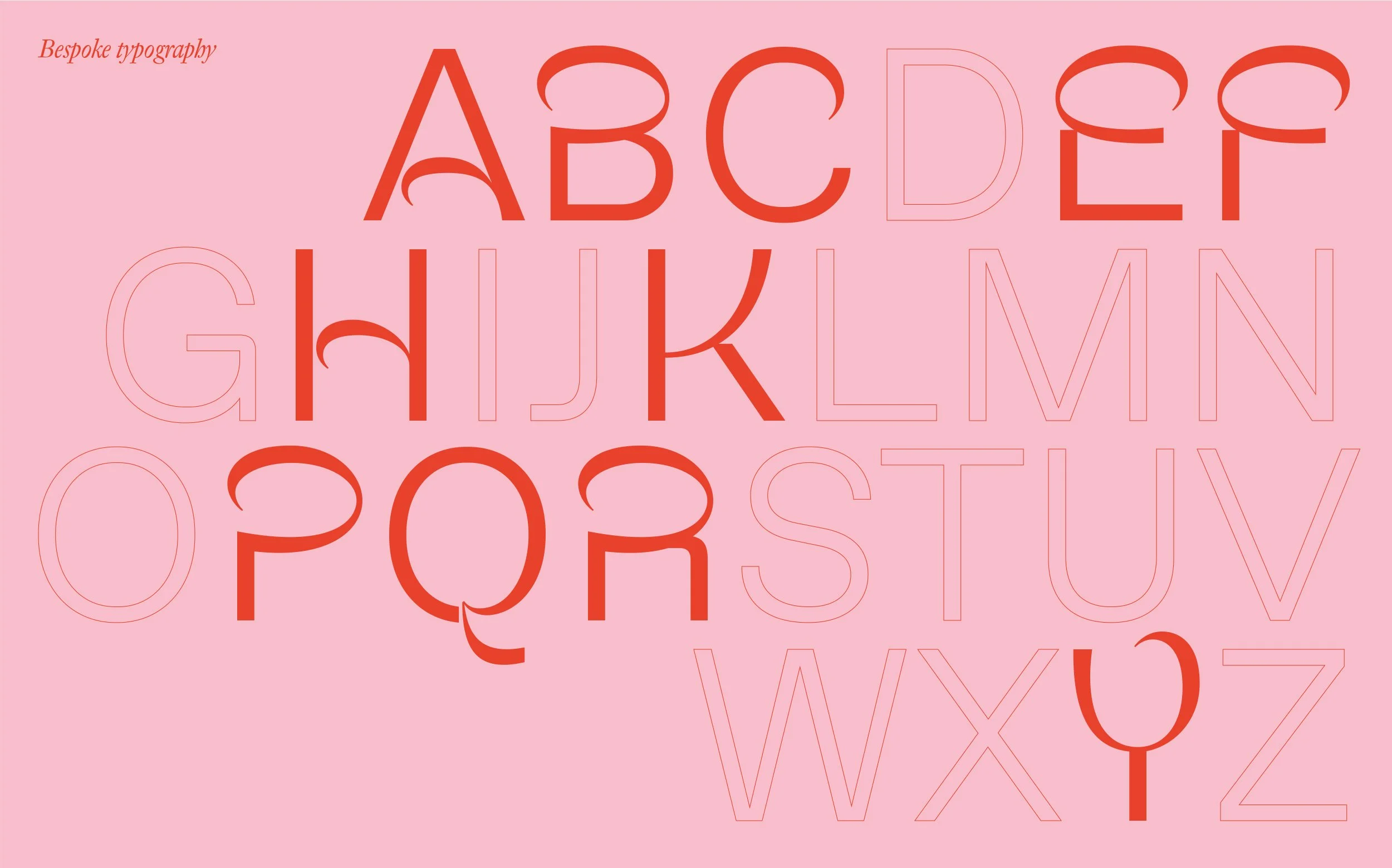
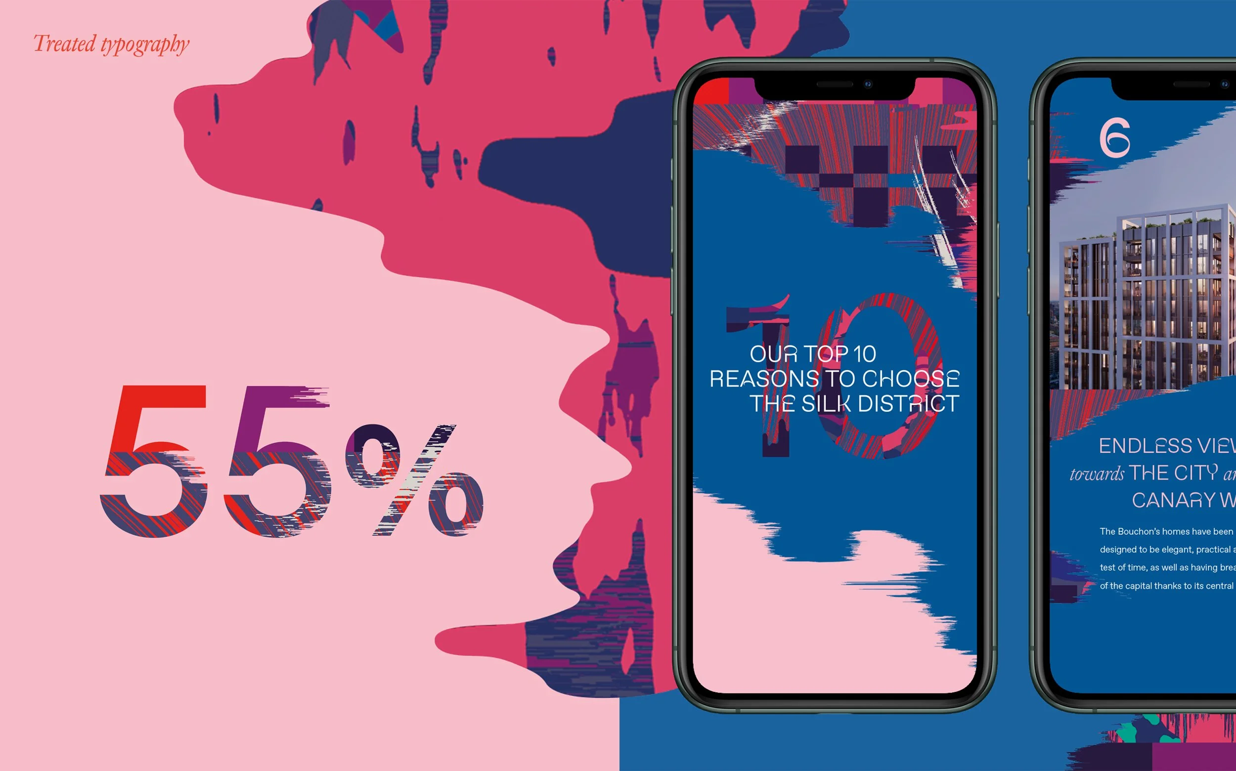
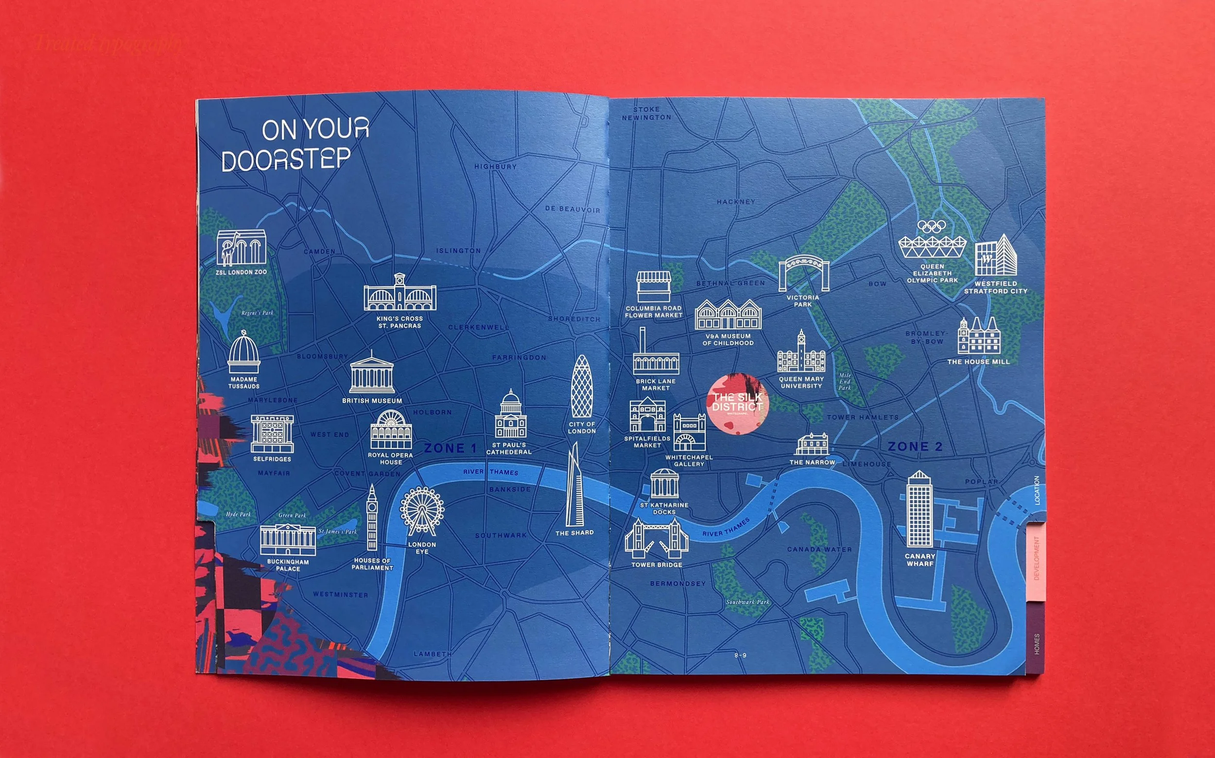
As part of the refresh we developed bespoke typography, graphics and an extended colour palette, as well as a bold approach to colour use (we love colour) across an extensive and varied suite of collateral.
Client
Mount Anvil
DATE
2019
Visual Identity, Print, Floorplan design, Digital, Campaign
services